In today’s fast-paced world, where the average human attention span is just 8.25 seconds and it keeps getting shorter than ever, crafting presentation designs that captivate and retain audience attention has never been more crucial. Whether you’re pitching a new idea to investors, presenting quarterly results to stakeholders, or delivering a keynote at a conference, the power of well-designed presentation slides cannot be underestimated. Not only do they play a pivotal role in effectively communicating your message, but they also have the potential to make your content memorable, distinguishing you from the competition.
This article will guide you through the fundamental aspects of creating engaging presentation designs, from understanding the basics of visually appealing slides to employing advanced techniques like animations, infographics, and effective typography. Additionally, you’ll discover strategies for focusing on engagement and interactivity, which are key to maintaining audience interest.
What Defines a Better Presentation Design?
A better presentation design refers to one that maximises clarity, engagement, and aesthetic appeal, ensuring effective communication of content while maintaining a cohesive and professional visual style. It achieves clarity through concise and well-structured content, utilising clear headings and minimal text per slide to avoid overwhelming the audience. Its visual appeal is crucial, employing a harmonious colour scheme, high-quality images, and consistent use of fonts and styles that align with the presentation's purpose and branding.
Moreover, a better presentation design integrates interactive elements, storytelling techniques, and thoughtful use of multimedia to enhance audience understanding and retention. Ultimately, it is a balance of simplicity, visual coherence, and audience engagement that defines a superior presentation design, ensuring that the message resonates effectively with its intended audience.
Tips and Tricks for Crafting Presentation Design that Stands Out
Crafting a presentation that captivates and communicates effectively involves mastering the art of visual communication and engagement. Here are some essential tips to help you create a standout presentation design.
1. The Colour Palette: Painting Emotions and Memories
Imagine walking into a room painted entirely in beige. Imagine the same room splashed with a carefully curated mix of bold and complementary colours. Which one would you remember? The same principle applies to presentations. Unique colour schemes are the secret sauce of memorable designs. They:
- Set the mood and evoke emotions.
- Guide the viewer's attention.
- Reinforce your brand identity.
Colour choices can evoke emotions and anchor your message in the minds of your audience. Studies have shown that different colours evoke different feelings in many people, so when selecting colours for your presentation slides, ensure you use colours that will effectively communicate the tone of your message emotionally and resonate with your audience.
For instance, a sales team presenting growth strategies might use:
- energetic reds to signify action
- stable blues to represent trust
- vibrant greens to symbolise growth
2. Typography: The Silent Communicator
Font choice is more than just aesthetics—it's about
personality and readability. Font choice in presentation
design is crucial for readability, visual appeal, and
coherence. It ensures text is easy to read and enhances
aesthetic qualities like professionalism or creativity. Font
selection plays a critical role in establishing the
professional tone of a presentation design by aligning with
the overall aesthetic and cultural context. For instance, a
playful font might work wonders for a creative agency's
pitch but could undermine the gravitas of a financial
report.
Consider these font pairings:
- Serif (e.g., Georgia, Garamond, Baskerville, etc.) for headlines with Sans-serif (e.g., Arial, Roboto, Helvetica, etc.) for body text
- Modern (e.g., Futura, Helvetica Neue, Avenir, etc.) for tech presentations
- Script fonts (e.g., Lobster, Great Vibes, Alex Brush, etc.) for elegant, high-end product launches
Remember, legibility trumps creativity. Your audience should never struggle to read your content on the slides.
3. Guiding the Eye: Visual Hierarchy in Action
Visual hierarchy is the secret sauce that makes information
digestible. Visual hierarchy in presentation design involves
strategically arranging elements like fonts, colours, and
layout to guide the audience's focus, emphasise important
information, and organise content in a clear and engaging
manner, ensuring effective communication and retention of
key messages throughout the presentation.
Key techniques include:
- Size variation (bigger = more important)
- Colour contrast to highlight crucial points
- White space to give content room to breathe
4. Infographics: Data's Best Friend
In the age of information overload, infographics are your
secret weapon. Infographics are essential in presentation
design for their ability to visually simplify complex
information using a combination of text, images, and
graphics. They enhance clarity by breaking down data into
easily digestible segments, making it more memorable and
understandable for audiences. Infographics facilitate
storytelling through visual narratives and sequential
information flow, structuring presentations in a compelling
and logical manner that resonates with viewers.
For a business meeting presenting quarterly results,
consider:
- Pie charts for market share.
- Bar graphs for year-over-year growth.
- Icon-based graphics for key performance indicators.
Or a historian lecturer can use timeline infographics to visually depict chronological events or historical developments using a linear or nonlinear timeline format.
5. The Magic of Animation: Bringing Slides to Life
Thoughtful animations can transform static slides into dynamic storytelling tools. Animations in presentations serve multiple crucial purposes: they enhance emphasis and focus by drawing attention to key elements, facilitate visual storytelling by dynamically illustrating concepts, aid in information retention by breaking down complex topics into digestible segments, enhance the overall professionalism and modernity of the presentation, and encourage interactivity through engaging elements like clickable features or interactive diagrams.
For instance, in a software features presentation, animations can sequentially highlight and explain each feature, ensuring clarity and maintaining audience engagement throughout the presentation.
6. Keep It Clear: Simplicity Speaks Volumes
Keep your slides clean and uncluttered. By eliminating unnecessary details and distractions, a simple design enhances readability and comprehension, allowing the core message to shine through. Use concise text, impactful visuals, and minimalistic design elements to maintain focus on key points and avoid overwhelming your audience. Emphasising simplicity not only makes the content more accessible and memorable but also demonstrates professionalism and a keen understanding of the audience’s needs.
Use the "rule of thirds" for slide layout, dividing each slide into thirds both horizontally and vertically to guide the placement of content. Limit each slide to one main idea or point, supported by minimal text and clear visuals.
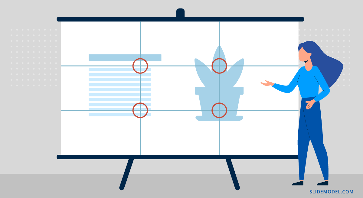
Illustration of the rule of thirds on how to place images
inside a slide to grab the audience’s interest.
IMAGE CREDIT: slidemodel.com
7. Visual Brilliance: High-Quality Imagery That Speaks
As the saying goes, "A picture is worth a thousand words," and in presentation design, high-quality imagery can be worth even more. Investing in high-resolution images and visuals demonstrates a commitment to quality and attention to detail, setting the tone for a polished and impactful presentation. Incorporate high-resolution images, charts, graphs, and icons that are visually appealing and relevant to your content. Quality visuals not only enhance aesthetics but also improve comprehension and retention. High-quality imagery adds depth and clarity, making complex data and concepts easier to understand and more memorable. Whether you're showcasing a product, explaining intricate processes, or highlighting key statistics, crisp and vibrant images can evoke emotions, illustrate points effectively, and create a lasting impression.
For instance, a high-quality dramatic landscape photo can be used to emphasise the vastness of a market opportunity or the impact of climate change.
8. Seamless Flow: Captivate with Dynamic Transitions
Incorporating dynamic transitions into your presentation can significantly enhance the audience's experience by creating a seamless flow between slides and maintaining their engagement. Unlike static slides that abruptly shift from one point to the next, dynamic transitions offer smooth, subtle movements that guide viewers naturally through your narrative. These transitions can emphasise key points, highlight changes in topics, and keep the presentation lively without being distracting. By carefully selecting transitions that complement your content, you can ensure that your presentation remains cohesive and professional, capturing and retaining the audience's attention from start to finish.
For instance, the morph transition dynamically transforms elements from the key statistics slide into related elements on the case study slide. This sophisticated transition visually connects the data to its real-world application, reinforcing the message with a cohesive and engaging effect.
9. Design with Ease: Professional Templates and Layouts
Using templates and layouts is time-saving and guarantees ease of design. Templates provide a uniform look and feel throughout the presentation, incorporating design elements like colours, fonts, and slide structures that enhance visual appeal and clarity. They save time by offering pre-designed formats, allowing you to focus on crafting compelling content rather than starting from scratch. Professional templates also support branding efforts by integrating logos and brand colours, reinforcing identity and credibility. Well-designed layouts prioritise readability and organization, making complex information easily understandable and engaging for the audience. Ultimately, templates streamline the design process, enhance audience engagement, and ensure that presentations are both visually appealing and effective in delivering their message.
Free and premium templates can be obtained from Canva, SlidesCarnival, SlideModel, Envato Elements, SlidesGo, Microsoft, Visme, SlideBean, and Prezi
10. Engage and Enlighten: Interactivity and Multimedia
By integrating clickable links, embedded videos, and interactive charts, you can create dynamic and engaging experiences that captivate audiences. These elements not only enhance understanding by providing visual and interactive demonstrations but also encourage active participation and deeper engagement with the content.
For instance, a new product presentation can have an embedded short video demonstrating the product feature or showcasing customer testimonials. The audience can also be allowed to click on hyperlinked icons or images to access additional resources or explore related topics, enhancing engagement and interactivity.
Conclusion
Throughout this article, we’ve explored the essential strategies and techniques required to create presentation designs that not only captivate audiences but also leave a lasting impression. From the significance of effective typography and colour choices to the innovative use of infographics, interactive multimedia, animations and transitions. By embracing these principles, you can elevate your messages, making them more engaging, understandable, and impactful.
As we conclude, remember that the journey towards improving the design of your presentation slides is ongoing, driven by creativity, clarity, and a commitment to delivering value to your audience. By continually seeking ways to refine and adapt your approach, you can create presentations that not only communicate your message effectively but also inspire and resonate long after the final slide.
With all these tips, do you still think you need a professional designer for your presentation design needs? Look no further than PT Creativity & Imprints. Our team of skilled designers is dedicated to crafting innovative and visually compelling presentations that effectively convey your message and captivate your audience. Whether you need a business pitch, educational material, or a creative showcase, PT Creativity & Imprints offers personalised services to meet your unique needs. Contact us today or simply fill out our presentation design project form, and our team will contact you to begin transforming your ideas into powerful visual stories that leave a lasting impression.